Most apps do not die loudly. There is no single catastrophic failure, no critical bug that makes headlines. They bleed slowly — a few hundred uninstalls a week, a Day 7 retention rate that never moves, an App Store rating that settles permanently at 3.2 stars. The engineers keep shipping features. The marketing team keeps buying installs. And the UI/UX mistakes that are actually causing the problem stay invisible because they never throw errors.
At Stintlief, we audit a lot of apps. Across categories — fintech, edtech, food delivery, e-commerce, SaaS. The same problems keep appearing. Not exotic edge cases. Ordinary design decisions that nobody questioned at the time, quietly doing damage in the background.
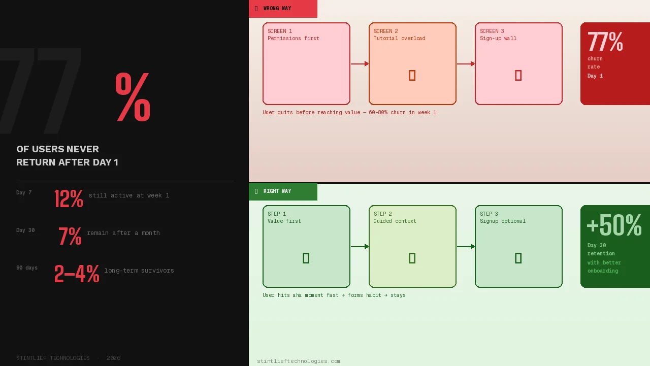
The numbers behind these UI/UX mistakes are unforgiving. Average Day 1 retention sits at around 25–28% in 2026. By Day 7, you have lost roughly 70–80% of everyone who ever downloaded the app. By Day 30, more than 90% of users are gone. Apps lose approximately 77% of daily active users within three days of install. This is the baseline — and most of these losses happen because of problems that are fixable.
This is what those problems actually are.
UI/UX Mistake #1: Onboarding That Teaches Instead of Delivers
The most common onboarding mistake in 2026 is treating the first session as a tutorial. You have built something. You are proud of it. There are features worth explaining. So you walk new users through them — slides, tooltips, videos, progress bars, permission requests — all before they have done a single thing that made them download the app in the first place.
Users do not want to be taught. They want to accomplish something.
Research consistently shows that apps lose 60–80% of users in the first week because users never reach a clear “aha moment” — the first instance where the product delivers the value it promised. Every screen of onboarding that sits between a user and that moment is a screen that costs you retention.
The pattern that works: deliver value first, explain later. Spotify plays a song. Calm starts a meditation. Notion opens a blank page. You can teach people how to use advanced features once they care about the product. You cannot teach them to care.
What to fix: Map your onboarding to one goal — get users to their first meaningful action as fast as possible. Defer account creation. Ask only for permissions you need in the first session. Skip screens that explain things users have not asked about yet. Smooth onboarding has been shown to increase Day 30 retention by up to 50% and boost weekly engagement by 90% in some categories.
UI/UX Mistake #2: Permission Requests at the Wrong Moment
Every app needs permissions. Location, notifications, camera, contacts — depending on what you are building, some or all of these are legitimate requirements. The UI/UX mistake is not asking for them. It is asking for them at the wrong moment, before users understand why they should say yes.
When a permission dialog appears with no context — “Allow this app to access your location?” — users have no reason to agree. They have not yet used the feature that needs it. They do not know what they will get. So they tap “Don’t Allow,” and you have permanently broken a feature before they even tried it.
On iOS, you only get one chance to ask for a system permission. If the user denies it, they have to dig into Settings themselves to change it. Most will not. In 2026, iOS and Android both make it trivially easy to silence an app permanently from the lock screen. Users are not tolerant of friction they did not consent to.
What to fix: Ask for permissions only when the feature that needs them is first triggered. Brief users before the system dialog appears — one sentence explaining what you are asking for and why it benefits them. Never stack multiple permission requests at launch. The user who understands why you need their location will say yes. The user who sees a generic prompt at startup will not.
UI/UX Mistake #3: Navigation That Users Have to Figure Out
There is a specific kind of UI/UX mistake that designers sometimes make on purpose, thinking it looks clean: replacing labeled navigation with icon-only menus, hiding primary actions in hamburger menus, inventing custom navigation patterns because the standard ones feel obvious.
In 2026, over 72% of users access apps on mobile-first. Users form an opinion about your app in about 0.05 seconds. And what they need in that moment is not cleverness — it is recognition. If they have to figure out where to tap, you have already lost some of them.
The data on this is consistent. Apps with bottom navigation see users finding core features 21% faster than apps with top navigation or hamburger menus. That speed difference directly affects whether users complete their first meaningful action — which directly affects Day 7 retention. The apps that retain users do not hide primary navigation. They make it visible, labeled, and predictable.
What to fix: Use a labeled bottom navigation bar for apps with 3–5 core destinations. Do not hide features that users need daily in hamburger menus. If you must use icon-only navigation for space reasons, test it with real users who have never seen your app before. If they cannot name what each icon does in five seconds, add labels.
UI/UX Mistake #4: Notification Overload — Sending More Instead of Sending Right
Push notifications should bring users back. In practice, they often do the opposite.
In 2026, iOS and Android make it trivial to permanently silence an app from the lock screen — directly, in one tap, without opening Settings. Users’ phones are smarter, their Focus modes are more aggressive, and their tolerance for noise is lower than it has ever been. When an app abuses the notification channel, users do not politely unsubscribe. They mute the app entirely or uninstall.
The UI/UX mistake is not sending push notifications. It is treating them as a growth lever when they are actually a trust signal. Every notification you send is a test of whether users believe you respect their attention. Send the right one at the right moment, and they open it. Send too many, send generic ones, send guilt-based copy (“You have been gone for 5 days 😢”), and you are actively encouraging churn — often weeks before that churn shows up in your metrics.
Research in human-computer interaction confirms that users do not inherently dislike notifications. They dislike losing control over them. When forced into an all-or-nothing permission choice, most users choose nothing.
What to fix: Separate transactional notifications (order updates, security alerts) from promotional ones (re-engagement, marketing) — both at the system level and in your UX. Apply different frequency limits to each category. Give users granular notification preferences, not a single toggle. Never use manipulative copy. If your engagement metrics only move when you send more notifications, that is a product problem, not a notifications problem.
UI/UX Mistake #5: No Feedback When Users Take Actions
Users tap a button. Nothing visibly happens. They tap it again. Still nothing. They tap three more times. The app submits five identical requests. Or they conclude the app is broken and close it.
Missing feedback states are one of the most common silent killers of trust in mobile UX. Every interactive element — every button, every form submission, every swipe — needs a visible response. Not for aesthetic reasons. Because users need confirmation that the system received their input and is doing something with it.
This matters even more on slow connections, which are still a reality for a significant share of Indian users outside metro areas. When a user on a patchy 4G connection submits a payment and sees nothing happen for three seconds, they do not assume the app is loading. They assume it failed.
What to fix: Every button needs a loading state. Every form submission needs a success or error confirmation. Every destructive action (delete, cancel, remove) needs a confirmation step with clear language. Micro-interactions — small animations that confirm a tap, show a loading state, indicate success — are not decorative details. They are functional communication that keeps users informed and in control. Studies show perceived wait times increase by 36% with passive loaders versus skeleton screens that communicate progress.
UI/UX Mistake #6: Designing for Features, Not for Outcomes
There is a pattern that appears in almost every product audit we do: the app is built around what the product does, not around what the user is trying to achieve.
This shows up as cluttered dashboards that surface every metric, not the ones the user cares about right now. It shows up as navigation structured around internal product teams rather than user tasks. It shows up as onboarding that walks through every feature rather than helping users complete their first goal. The underlying UI/UX mistake is the same in each case: the design was made for the product, not the person using it.
The result is cognitive overload — the mental effort of using an app exceeds the value it delivers. Users do not consciously think “this app has too high a cognitive load.” They just feel tired, confused, or unsatisfied, and they close it. High cognitive load is one of the strongest predictors of early churn.
Zerodha, operating in one of the most complex domains (stock trading), has built its reputation largely on reducing complexity. It surfaces only essential actions. Advanced features are accessible but not prominent. The interface communicates confidence, not capability. Users trust it because it does not overwhelm them.
What to fix: For every screen in your app, ask: what is the one thing a user is trying to do here? Design the screen to make that one thing effortless. Move everything else to a secondary level. If you cannot answer what the primary goal of a screen is, that is the problem to solve before anything else.
UI/UX Mistake #7: Dark Patterns That Trade Short-Term Metrics for Long-Term Trust
Dark patterns are UI/UX mistakes that are sometimes made intentionally. Difficult cancellation flows. Pre-ticked consent boxes. Fake urgency. Confusing subscription prompts that look like one-time purchases. Hidden costs that appear at the final checkout step.
They work. In the short term, they increase conversions, reduce churn in monthly reports, and make metrics look better than they are. That is why teams use them.
The long-term damage is the part that is harder to quantify until it is too late. Users who feel tricked do not return. They leave reviews. They tell people. In 2026, regulators are also paying attention — the EU Digital Services Act, GDPR, CCPA, and FTC rules all create real legal risk for apps using manipulative UX patterns. App stores can remove apps that violate these guidelines.
The more important point, though, is not legal risk. It is that dark patterns signal the same thing to every user who encounters them: this product does not respect you. That impression, once formed, is almost impossible to recover from. You cannot retain users who distrust you.
What to fix: Make cancellation as easy as signup. Show full pricing before the final step. Make consent boxes opt-in, not pre-checked. Treat your paywall like a landing page — clear headline, honest benefit list, trust signals, one CTA. If your growth numbers require users to be confused, that is a product-market fit problem, not a UX problem.
UI/UX Mistake #8: Ignoring Empty States
Empty states are what users see when they first open a feature, before they have created any content or data. A new user’s activity feed. A dashboard with no transactions. A contacts list with no connections.
Most apps treat empty states as placeholder screens — a graphic and a line of text that says something like “No items yet.” That is a missed opportunity. In 2026, empty states are activation moments.
The user who lands on an empty state is in a specific mindset: they know what the feature is supposed to do, they have not done it yet, and they are deciding whether to bother. An empty state that just says “nothing here” confirms there is nothing to do and nudges them toward leaving. An empty state that shows them exactly how to get started — with a specific call to action, perhaps a pre-filled example, or a shortcut to the one action that fills the screen — turns hesitation into activation.
What to fix: Design an empty state for every feature screen, not as an afterthought but as part of the initial design. Write the copy to be specific and action-oriented. “Add your first expense to start tracking” is more useful than “No expenses found.” Show users what the feature looks like when it is working, so they understand what they are working toward.
UI/UX Mistake #9: Visual Inconsistency Across Screens
When buttons look different on different screens, when spacing is irregular between similar elements, when typography shifts without reason, when colours carry different meanings in different parts of the app — users notice. Not always consciously. They experience it as a vague sense that the app feels unfinished, that something is slightly off.
Inconsistency undermines credibility. It increases cognitive load because users cannot rely on learned patterns — they have to re-evaluate what each element means every time they see it. And in an environment where users are making constant micro-decisions about whether to keep engaging or close the app, that additional friction matters.
This is also a sign of a more significant problem: no design system. Apps without enforced component libraries accumulate UI/UX mistakes gradually, one screen at a time, as different team members make different decisions. By the time the inconsistency is visible to users, fixing it requires a systematic audit rather than a quick patch.
What to fix: Build a design system and enforce it. Consistent components, spacing tokens, typography scales, and colour usage rules reduce both confusion for users and decision fatigue for your team. Every new screen should draw from the same library of components rather than creating new ones. Inconsistency at the design level produces inconsistency at the experience level — which produces churn
UI/UX Mistake #10: Not Measuring What Is Actually Causing Drop-Off
The last UI/UX mistake is the one that makes all the others invisible: not using the right data to find where users are leaving and why.
Most teams track aggregate retention — the overall percentage of users still active at Day 7 or Day 30. This number tells you that you have a problem. It does not tell you where the problem is. If you add a feature that significantly improves retention for a specific cohort of users, an aggregate rate will not show you that. You need cohort analysis.
The tools for this exist and are accessible. UXCam shows rage taps, failed swipes, and confused scroll patterns — the physical signals of user frustration that never appear in aggregate data. Mixpanel and Amplitude show where users vanish in your funnel, which features they use before dropping off, and which actions correlate with long-term retention. Heatmaps and session recordings show what users actually do, which is often quite different from what you designed them to do.
What to fix: Track retention by cohort, not just in aggregate. Identify the two or three screens where users drop off most frequently and audit those first — that is where the highest-return improvements are. Use session recordings to watch real users interact with your app. If you are building or scaling an app and you do not have this instrumentation in place yet, adding it is more valuable than shipping the next feature.
UI/UX Mistakes vs Retention: A Quick Reference
| Mistake | Retention Impact | Difficulty to Fix |
|---|---|---|
| Onboarding that teaches first | Very high — drives Day 1 churn | Medium |
| Wrong-moment permission requests | High — permanently blocks features | Low |
| Mystery meat navigation | High — increases early drop-off | Low |
| Notification overload | High — causes muting and uninstall | Medium |
| Missing feedback states | Medium — erodes trust gradually | Low |
| Feature-first design | Very high — causes cognitive overload | High |
| Dark patterns | High — destroys long-term trust | Low |
| Ignored empty states | Medium — missed activation opportunities | Low |
| Visual inconsistency | Medium — accumulates over time | High |
| No drop-off measurement | Very high — keeps all problems hidden | Medium |
If your app is losing users faster than it should and you cannot identify why, the answer is almost always in the UX rather than the feature set. Contact Stintlief Technologies to book a UI/UX audit. We will tell you exactly where your retention is leaking — before you spend another rupee on user acquisition.